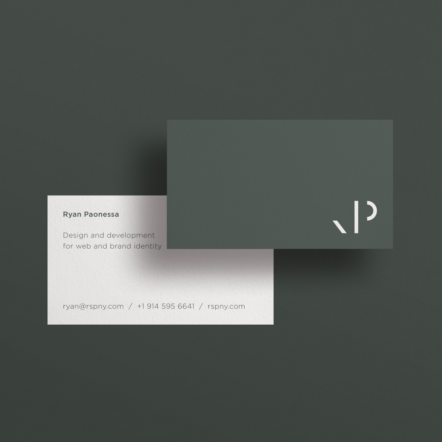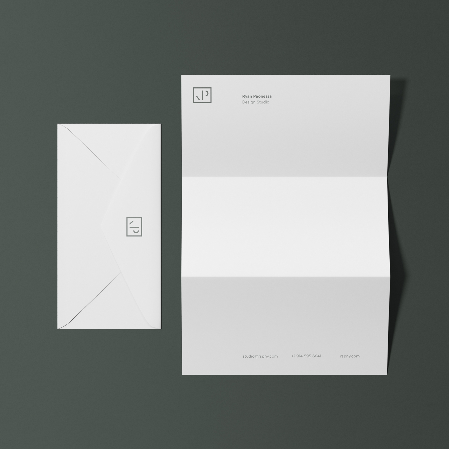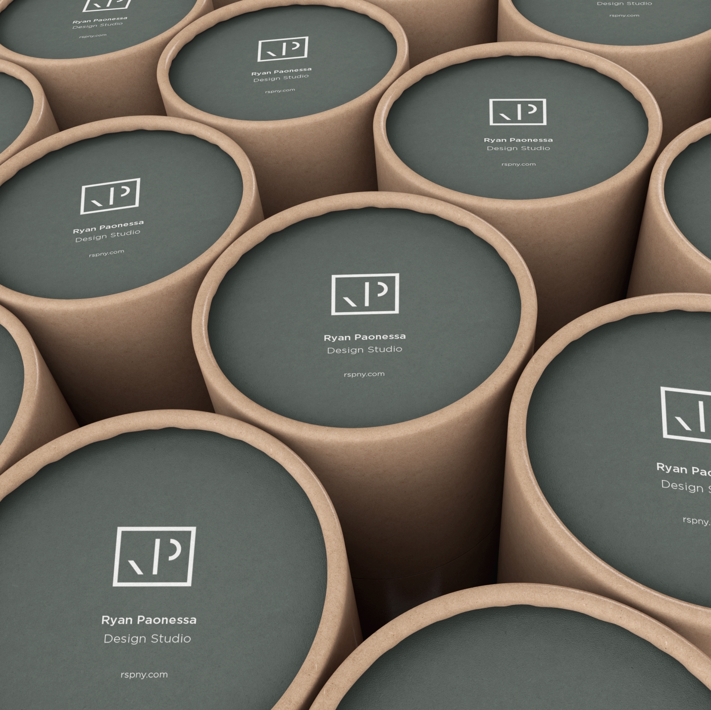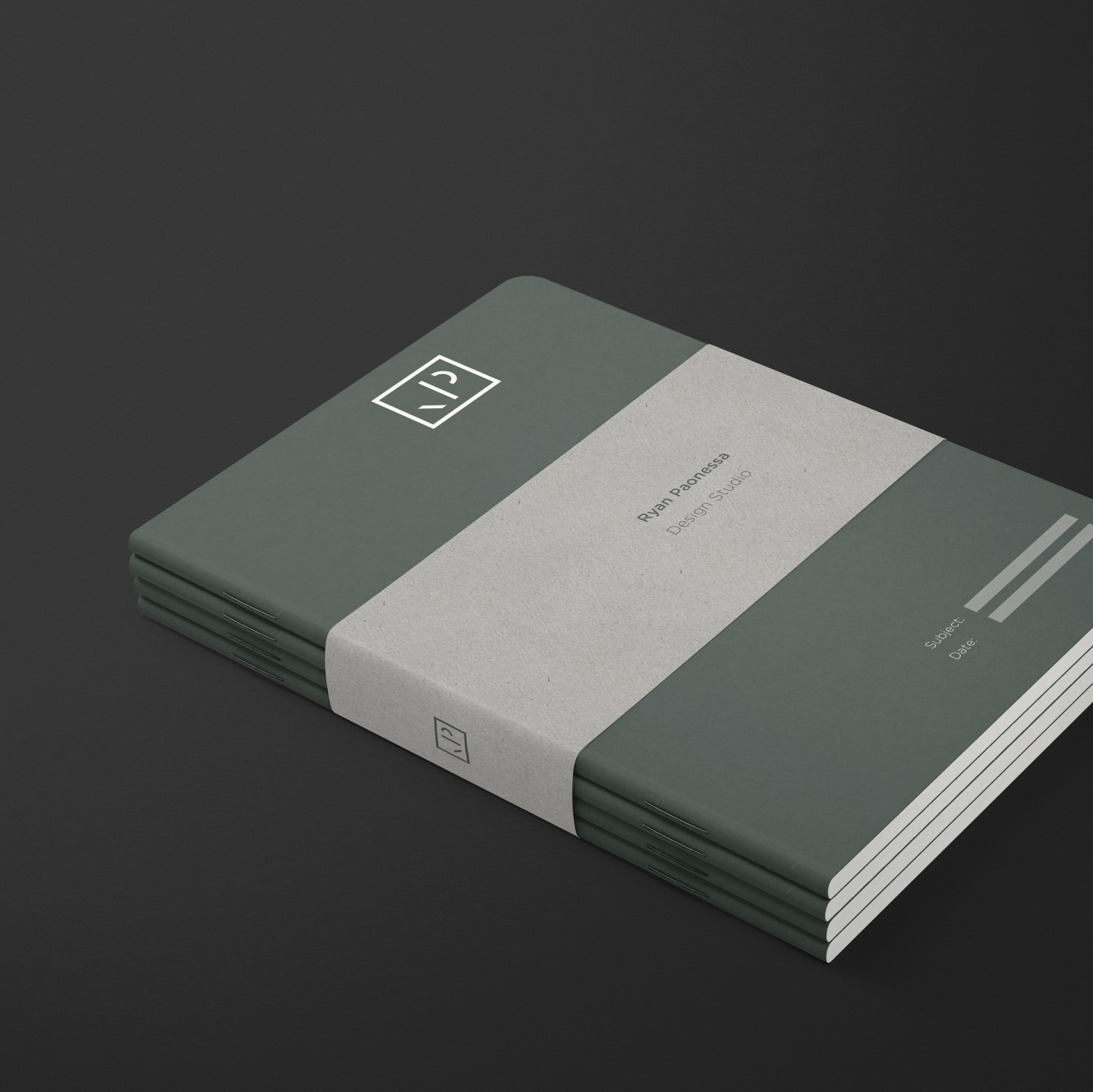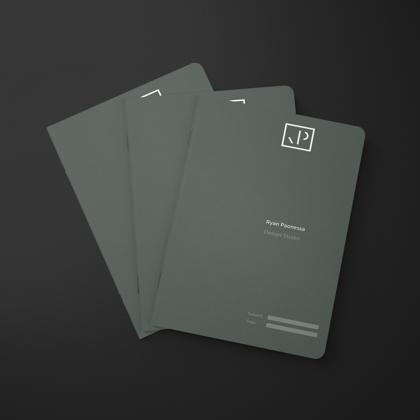


To coincide with the launch of a new website portfolio, a visual rebrand for Ryan Paonessa was necessary. The components of the brand identity needed to reflect client-based services, visual art, and miscellaneous topics that frequent the journal. The goal of the brand identity was to unify all of these individual aspects under one roof while maintaining enough freedom to expand in the future. Beyond the logo, a primary component of the identity, we wanted to create a cohesive system of color, typography, grids, and layout. All elements of the identity utilize the same drab green, smoke gray, and crème color-way as well as light and medium weights of the Gotham HTF font.
For the logo, an "RP" monogram, we referenced the components of individual letter parts. The inspiration for this came from H.F. Henderson's Understanding Molecular Typography (1992). The mark works well printed at almost any size (both physically and digitally) and is fun when used as a stamp or stencil. A custom stamp of the logo was also made to be used wherever necessary. For printed collateral, we focussed on things that would be used presently and most often, starting with business cards and letterhead then diving into packaging and stationary.


